Cliff Notes This is a synopsis (alias “Cliff Notes”) of a variety of work that I have completed, I hope that it gives you a reasonably brief, but sufficient amount of information—Onward!
Filter the Chaos
I thought this would be an apt lead piece as it blends both my traditional art with our modern Adobe tools. In both the Photoshop enhanced version and the original piece 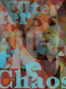 I was analyzing the juxtaposition between our need for peace and consistentancy and the reality of dealing with too much disconnect in our lives. The result can cause an overwhelming feeling of chaos at times, but we adapt and contend with it in our own ways.
I designed the Photoshop version thinking it would work well for a t-shirt design or a carry bag.
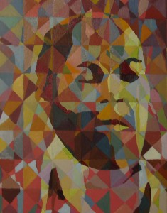
Filter the Chaos, Oil on Canvas, Mary Neuens-Eresh
CD Liner/ Front & Back
This is a piece from a group project; though all of the art displayed here as well as elsewhere on the site is my own creation from drawing hearts in the sand on Amsterdam Beach to the photography and Adobe work (unless otherwise noted).
Our group was given the task of branding and coming up with a name for a pop singer, and though I did not create the name or titles, I did create the art and chose the color scheme. We decided to create a teenage pop singer that would appeal to children and teens, but would also be parent friendly. I thought that it would work well to have this new pop star debut with a summer tour and summer theme, this decision affected the color scheme choice and led to imagery that would create a casual and fresh feeling. I used a split (additive) complimentary scheme, I used medium to low chroma colors to get a soft natural feel similar to the colors of a sandy beach, water, sky and grass.It was my goal to create imagery that would feel approachable, relatable, but also contemporary.
The art and type were put together in Illustrator, but photography, Photoshop and of course– Mother Nature were also employed. 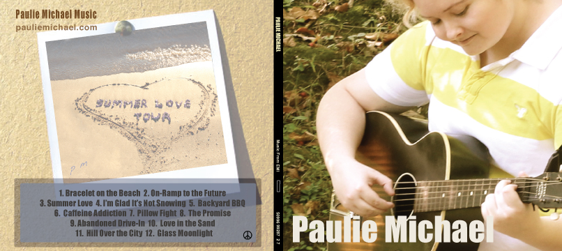
Product Creation and Photography
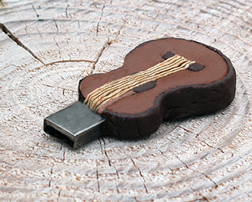
I created this jump drive as part of the Band Project (summarized above). The jump drive was conceived as a good promotional item to be given away to prospective fans, it would contain a free song as well as open storage space. I felt that making a custom guitar jump would make it memorable and more likely to be used. I made this prototype using Fimo Clay, and embedded an actual drive into it. This is also an example of my product photography, which was used on the website and in a brochure. For this item I used the top of a wooden post that was near the beach.
Cruise Itinerary
This project was created in Adobe InDesign, it is a great example of how to orchestrate a great deal of information in a way that allows the eye to move through the flyer, yet it gives good attention to the assortment of individualized details. The shapes, color and text work together to simulate the feeling of water, and collectively they achieve a cohesive piece. 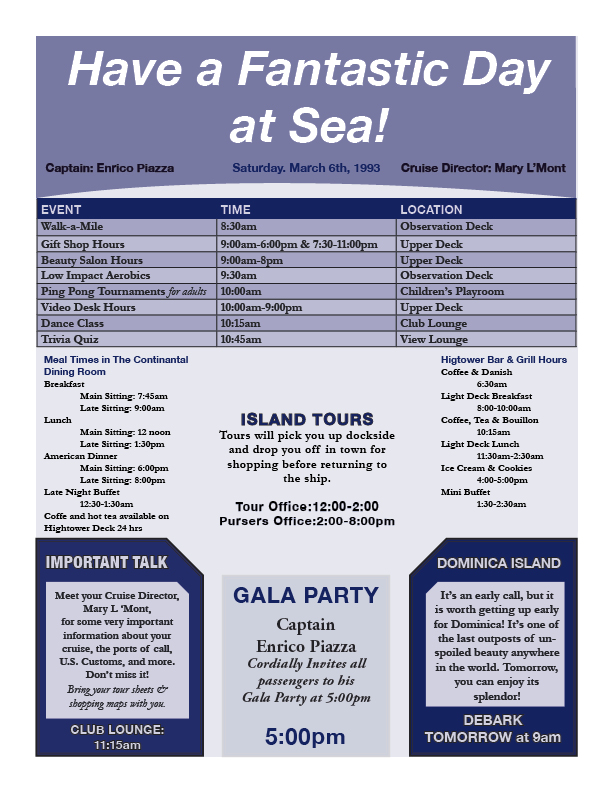
Wine Label
This wine label was created in Adobe Illustrator. I created one based on a small pre-existing winery in Colorado. I was designing for a sophisticated, traditional look, but also down-to-earth. It is meant to be reasonably inexpensive to produce and easy to apply to the bottle, yet producing a very professional expression. The photograph in the center is not my own, it was from a free site on the web.
Report (2-page Spread)
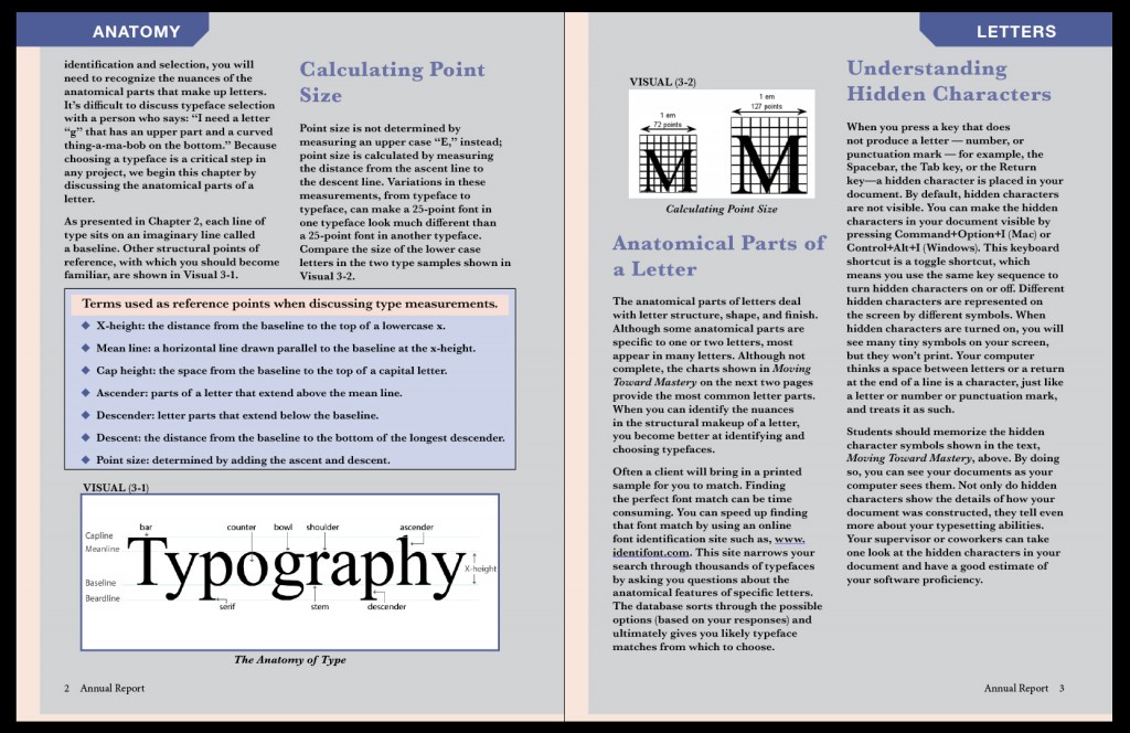
This image is a shot of two pages from a four-page document that was to be set up as if it was an annual report. The text to be used was pre-determined by the instructor, but each student was to fix the text, choose our own type and design elements, etc. I used InDesign, with some Photoshop work on the images.
Life Drawing
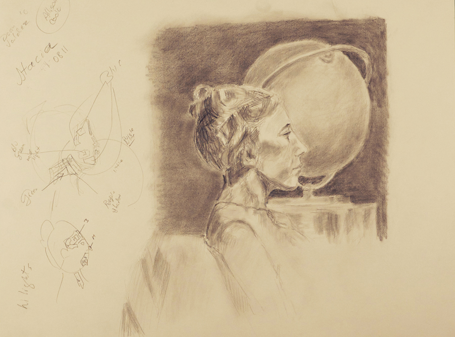
Many artists feel that drawing is the structure that all other art flows from, and though it is not so for everyone, that philosophy does resonate with me. Regardless of whether an artist physically draws on paper, or composes on the computer screen, it is best if a visual piece could work according to it’s basic composition and it’s dark to light relationships. This is an example of “life drawing”, which is to say that you’re simply observing someone or something, composing, and drawing on the spot, without the aid of photographs etc.
Logo
The following are two logos that I developed for the Village of Cleveland using Illustrator. They wanted to emphasize their location on the shores of Lake Michigan and express an upbeat fresh look. I created the one on the left with a modern look but with a traditional format and the one on the right with a very contemporary look.
